In my preparation to take a few weeks off and head on holidays, I got the dates of posting wrong, so the post that was meant to be posted on Monday went out on Sunday. I am not a big fan of breaking routines, so here is a bonus post to stick with the routine. It is also a lighthearted post, I think my disorientation explained further below could also have to do with a heavy workload and the fact I need a few weeks off to refocus. 
The heads up display or HUD in games is where the scores and important statistics are kept. It is where the player receives elements of feedback that are important to him or her to play the game. Things like how many moves you left, resources you have or are using, scoring, your placement in the game, performance against other players etc. Depending on the game the metrics will be different.
One of my current favourite games to chill out with is Gummy Drop and just last week they changed the HUD. The colours, the placement and where I could find vital information had all been moved around. The first time I played with it, I noticed something was different but played as usual, when the game ended suddenly without me understanding why I obviously went looking for my feedback mechanism and then couldn’t find the key information where it used to be. It took a number of turns before I managed to get my head around it.
I had created a way of playing where at a glance I could see where I was and what I had time or moves for. When that changed, I did experience a bit of disorientation and lost a few game lives before my mind had adjusted. When I started comparing the before and after pictures online, I have to say the difference is quite small. The colour scheme was the biggest changes and the tracking mechanisms became more subtle, maybe even sleeker in their design, it did impact the gameplay. Judge for yourself the difference is really tiny.
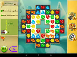
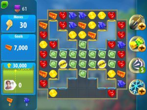
I found it bizarre that something so simply could have such an impact. It made me definitely reflect on how this could easily happen in iterations of gamification designs, where the end-user has already become used to a certain way of working and then we change it on them. If there is good reason to do it, then by all means do it. If however your play-tests show that people may experience disorientation, maybe move to introduce things gradually and question if it is really needed.
