Commuting in and out of work for most of us is one of those things we get used to. In my case I often have a regular new route in a new location and thankfully there are apps like Citymapper on the market to get me there. I have probably been a raving fan of the Citymapper app, especially in London. It so often saved me to arrive on time to new clients.
They are a good example on how to get the core user experience right in the first place. From a commuters perspective, knowing when you have to leave in order to get somewhere in time either by walking, cycling, public transport or Uber ride, is in my view a superbly helpful feature. The fact that most transport modalities are available is ideal. You don’t need 3 apps to figure it out. Since they are adding major cities in many countries I can use the one app in London and Stockholm, which I find delightful. It will be my first check on the road in new cities to find my best way around.
T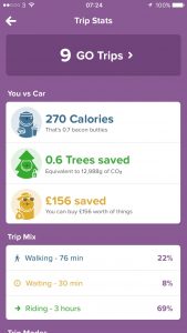 he tone of messaging in the application has always been fun. There is a rain free option and equally teleporting is an option. This week I spotted another novelty, namely the tracking of my journeys but not necessarily in the boring way, but rather it measures calorie count, insofar as no weight or height or anything is added in the app, it really is a guesstimate which is totally in line with their tone however. It tracks trees saved by making greenest transport choices and then money saved by choosing a more cost effective option. It gives you all the trips you used the app for, your breakdown of walking, waiting and riding and trip modes.
They want to encourage you to use the app on the regular commute to compare and race your own time. I only found this functionality by accident because I was checking out what the new statistics meant. I would however be open to tracking the regular commute (if there was such a thing as a regular one in my life) to see whether it differs much and hey you can play whilst doing your regular action. Finally if you are underway, you can share your journey with your friends or family to let them keep aware of your journey and progress. It can serve as a safety feature.
Anyway from a gamification design perspective, I found that the application used the exact right approach in getting its core functionality right, before adding game elements. Making joining in play easy and fully optional in my view is another quick win. Then keeping messaging similar to other already familiar features is great to see. A good example of how to do it right.
